

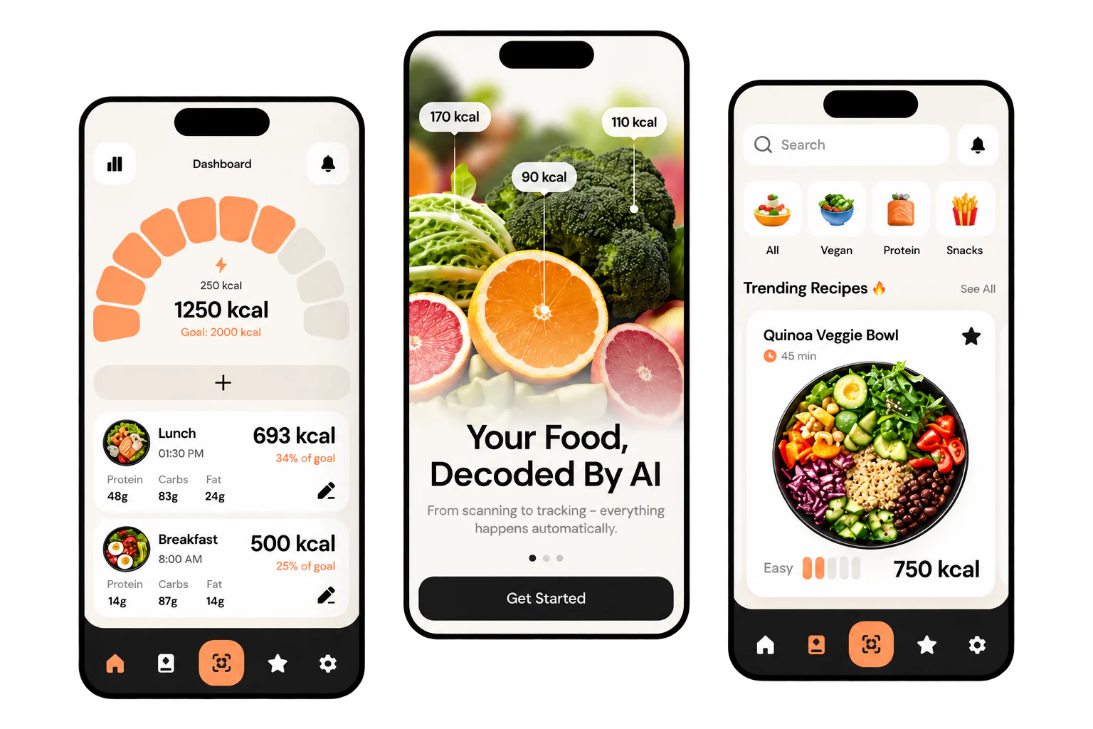
You’ve felt it. A checkout that asks for the same thing twice. A form that wipes everything because you missed one box. A button that doesn’t look like a button. You leave, and you don’t come back.
That’s not a looks problem. It’s a design problem. And when it happens on your website, nobody emails to tell you. They just close the tab.
Your staff can’t close the tab. So they tape the steps to the monitor and carry on.
Whose fault is it?
When someone gets stuck, I don’t ask what they did wrong. I ask what the design got wrong. If three people miss the same button, you don’t have three careless people. You have one bad button.
Your customers aren’t slow. They’re tapping with one thumb in a parking lot. Your staff aren’t bad with computers. They’ve got a customer waiting.
How you treat people is a big part of why customers come back. But on a Sunday night, you’re not there to help. The screen is.
So we design for the people using it. Not for awards. If something looks clever but slows someone down, it goes.
What UI and UX mean
UI stands for user interface. It’s what people see and tap: the buttons, menus, forms and the words on them.
UX stands for user experience. It’s how easy it is to do the thing they came for. How much guessing it takes. Whether they finish at all.
Which matters more? You need both, but ease comes first. A screen can look great and still lose people. A plain one can get them where they’re going.
And it isn’t just websites. It’s anything people tap or click: an app, a booking system, the software your team uses all day.
Fix it while it’s a sketch
It’s tempting to build first and sort out the confusing parts later. But later means after launch. By then, your customers are doing the testing for you.
Say your booking form makes people create an account before they can see a single open time. On a sketch, moving that step to the end is easy. Once it’s built, moving it means new code and more testing. You pay for both.
And you might not spot it yourself. You know your business too well to see it the way a stranger does. The people who’ll use it can. So we find those problems with them, while it’s still a sketch.
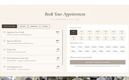
From research to finished design
- User research. We talk to the people who’ll use it, and whoever answers your phone, because they hear every question.
- User flows and wireframes. We map every step, cut the ones nobody needs and sketch each screen in plain boxes.
- Interactive prototype. You tap through it like the real thing before any code gets written.
- Usability testing. We watch people try it without helping, and fix wherever they get stuck.
- Visual design. Then we make it look great. Not before.
- Design system. The buttons, forms and layouts written down, so every new screen matches the last.
Testing sounds bigger than it is. There’s no lab. Just people who haven’t seen it before, the prototype and a simple job to do, like ordering a birthday cake for Saturday.
What you get isn’t a guess. It’s a design people have already tried, with notes on what tripped them up and what we changed.

When design is its own project
If we’re building you a straightforward website, this is already part of the build. You don’t need to pay for it twice.
It’s worth doing separately when:
- You’re planning an app or custom software, and you want to try it before you pay to build it.
- Customers call to ask how to do something your website already does.
- Your staff keep asking each other how to do the same thing.
- You paid for a new look, and people still get lost.
It’s for small business owners who’d rather fix the screen than blame the customer.
Want to go deeper? See how we approach Branding, or browse our recent work.

Where are people getting stuck?
Show us the screen where they give up, or the plans for what you’re about to build. If a few small fixes will do, we won’t sell you a redesign.