

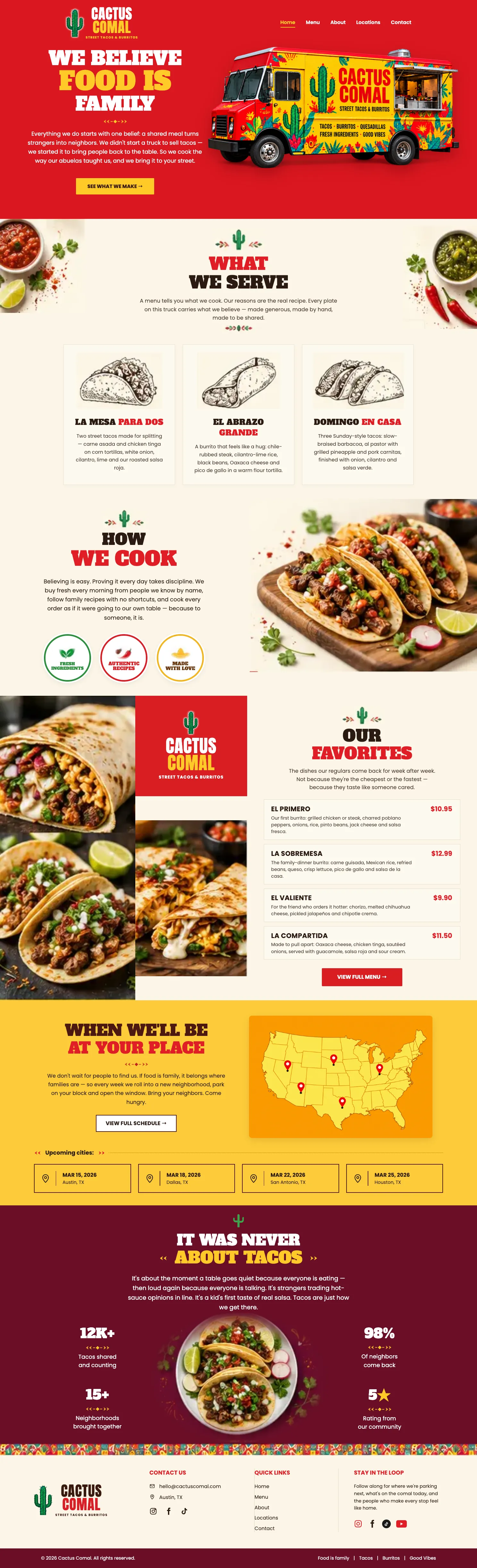
Most people come to me wanting to look more professional. Fair enough. But looking good isn’t the goal. Getting chosen is. That’s easier to show you than tell you.
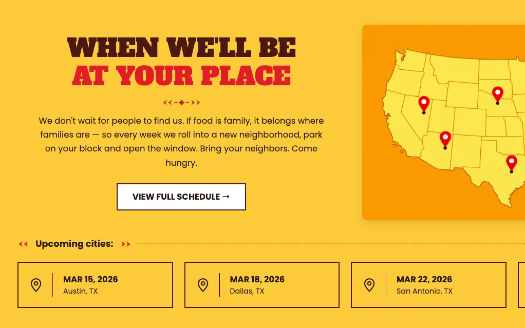
Cactus Comal is a taco and burrito truck we branded, and that’s its page up top. Read the first line again. It doesn’t say tacos.
It starts with one line
Cactus Comal sells tacos, burritos and quesadillas. So does every other truck in town. If the brand started there, it would sound like all of them. Tacos. Burritos. Best prices in town. Find us downtown.
So it starts with what they believe instead: food is family. They didn’t start a truck to sell tacos. They started it to bring people back to the table.
Same truck. Same tacos. One is a menu board. The other is a reason to walk over.
That’s the why. Next comes how they prove it, and last, what they sell. Everything in the brand grows out of that one line.
So what’s yours? Not what you sell. Why you started, and why it still matters on the days it’s hard.
Your brand is a feeling
Nobody loves a food truck for its font. They love what it feels like to eat there. Cactus Comal says so right on the page: it was never about tacos. It’s about the quiet when the food lands, the noise right after, and strangers in line trading hot-sauce opinions.
That feeling is the brand. It lives in your customers’ heads, not in a folder on your desktop. Our job is to put it into words and pictures, so people get it before they’ve ever met you.
So how do people feel after they deal with you? That’s your brand, whether you planned it or not.
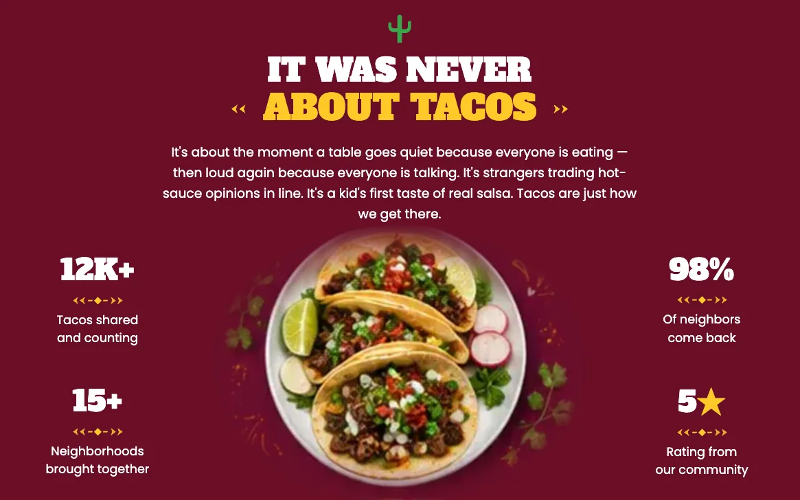
Then prove it
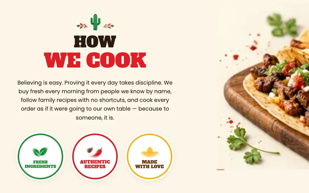
A belief on its own is just a nice sentence. Cactus Comal backs it up. The page tells you exactly how: they buy fresh every morning from people they know by name, follow family recipes and take no shortcuts.
What’s your version? Showing up when you said you would. The clean job site. The honest quote. The call you return the same afternoon.
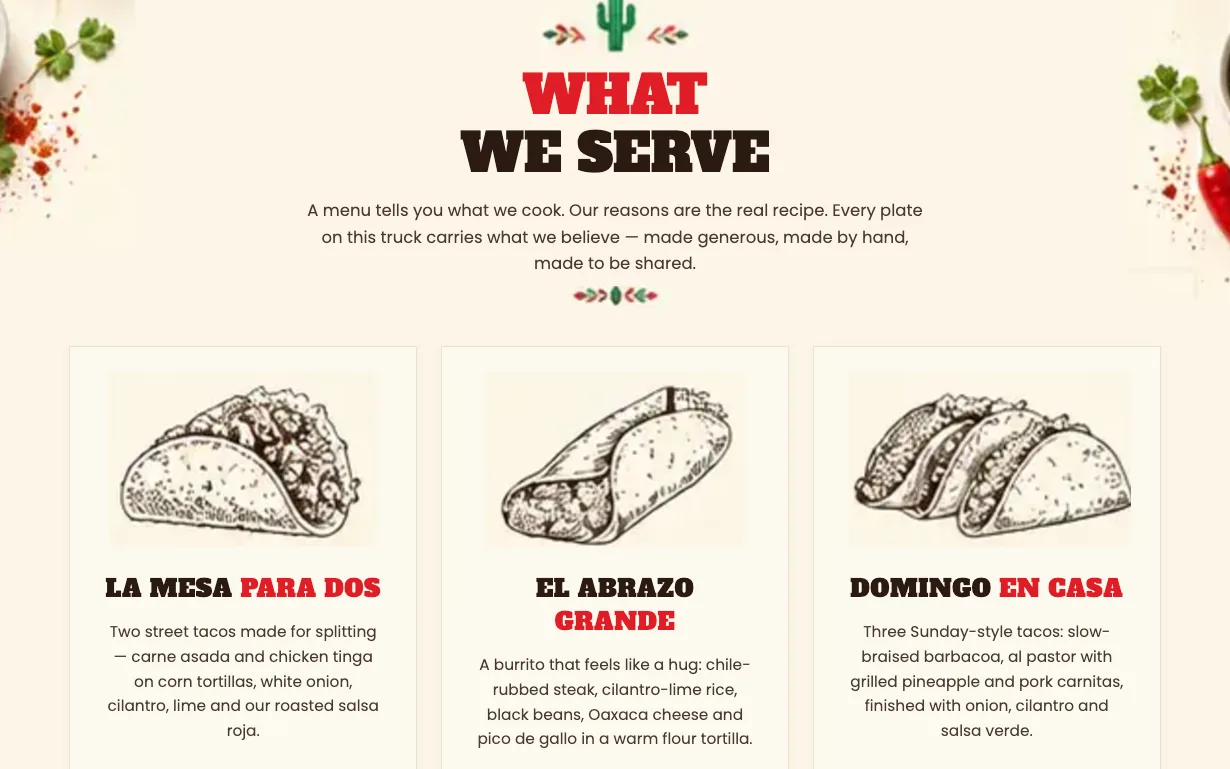
Even the menu says it
What they sell comes last, and it still points back to the why. You won’t find a Taco Combo #2. You’ll find La Mesa Para Dos, a table for two: street tacos made for splitting. El Abrazo Grande, a burrito that feels like a hug. Domingo en Casa, Sunday at home.
Their favourites aren’t sold as the cheapest or the fastest. They’re sold as tasting like someone cared. A cheaper truck can beat the price. It can’t beat that.
Now look at your own list of services. Does each one point back to why you started, or pull away from it?
You don’t need every customer. Cactus Comal isn’t chasing the cheapest-lunch crowd. It’s cooking for families, neighbours and the friend who always orders it hotter. Win the people who like how you do things. They stay, and they bring friends.
Same business, everywhere
Look at the truck. Then the page. Then the menu. Cactus Comal looks and sounds like the same business in all three. The footer even signs off with the line it opened with: food is family.
Now pull up your website, then look at your last invoice. Same business? Add your Google profile, your truck and the way you answer the phone. When they all feel like the same business, people relax. When they don’t, they start to wonder.
Growing without losing what made you good
The bigger you get, the easier it is to drift. New staff, new services, new places. One day the business that started on handshakes feels like everyone else.
A clear why stops the drift. When Cactus Comal heads to a new neighbourhood, it doesn’t need a new pitch. The page already says it: “If food is family, it belongs where families are.”
It works the same for you. Hiring gets simpler. So does pricing a job, or deciding what to take on. You already know what you stand for.
What you walk away with
A brand should leave you with things you can use. Your logo, colours and type are the starting point. Then we design the pieces your business actually puts in front of people.
Your set is shaped around how your business works, and we agree on the pieces before design begins.
- Your why, in one sentence you can say out loud
- A voice that sounds like you, from your website to your voicemail
- Logo versions, colours and type choices that work together
- Brand assets for your business: cards, labels, packaging or other agreed pieces
- Finished artwork for print and digital use, with a simple guide to keep it consistent
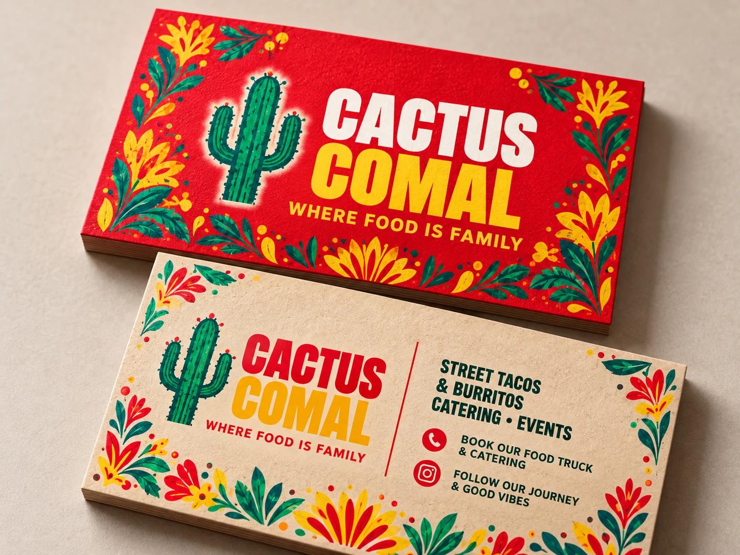
For Cactus Comal, that identity carries through the card someone keeps, the bag they take home and the label that seals their order. Here’s how those assets work together.
Business cards give someone a small piece of your business to keep. Cactus Comal’s name and “Where food is family” line lead the front. Catering and event information on the back gives people a reason to get in touch.
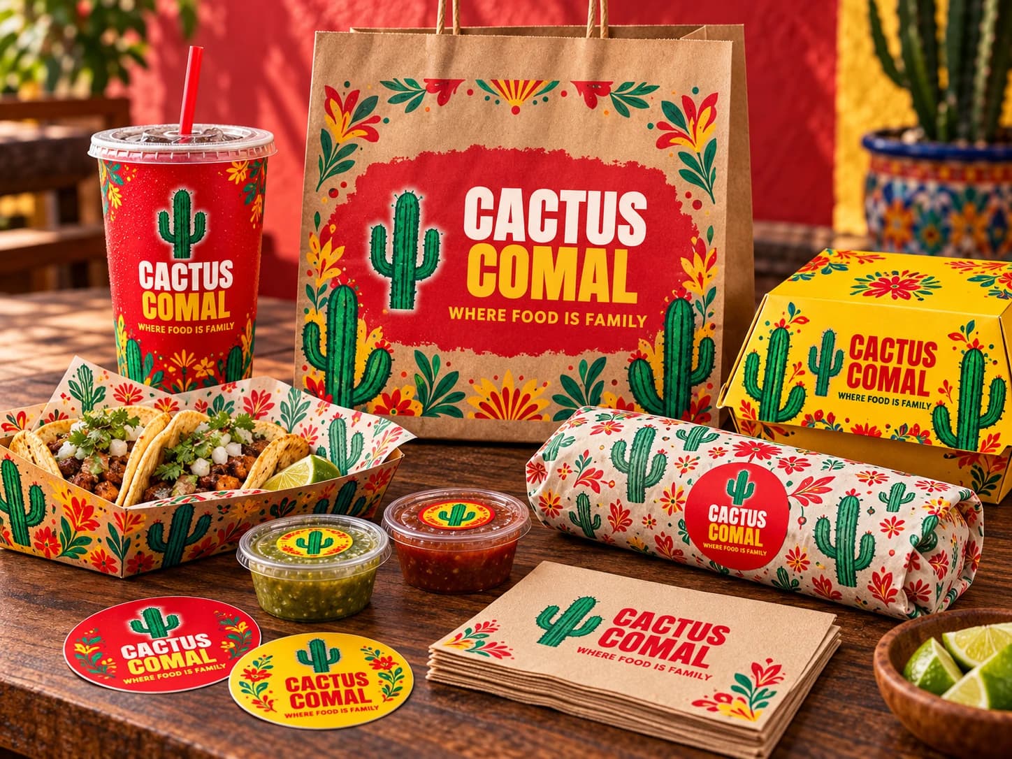
Packaging carries the brand into the order itself. Cactus Comal’s bags, cups, food boxes and wrapping share the same cactus, flowers and colours. Each piece belongs to the same set, even when its shape or material changes.
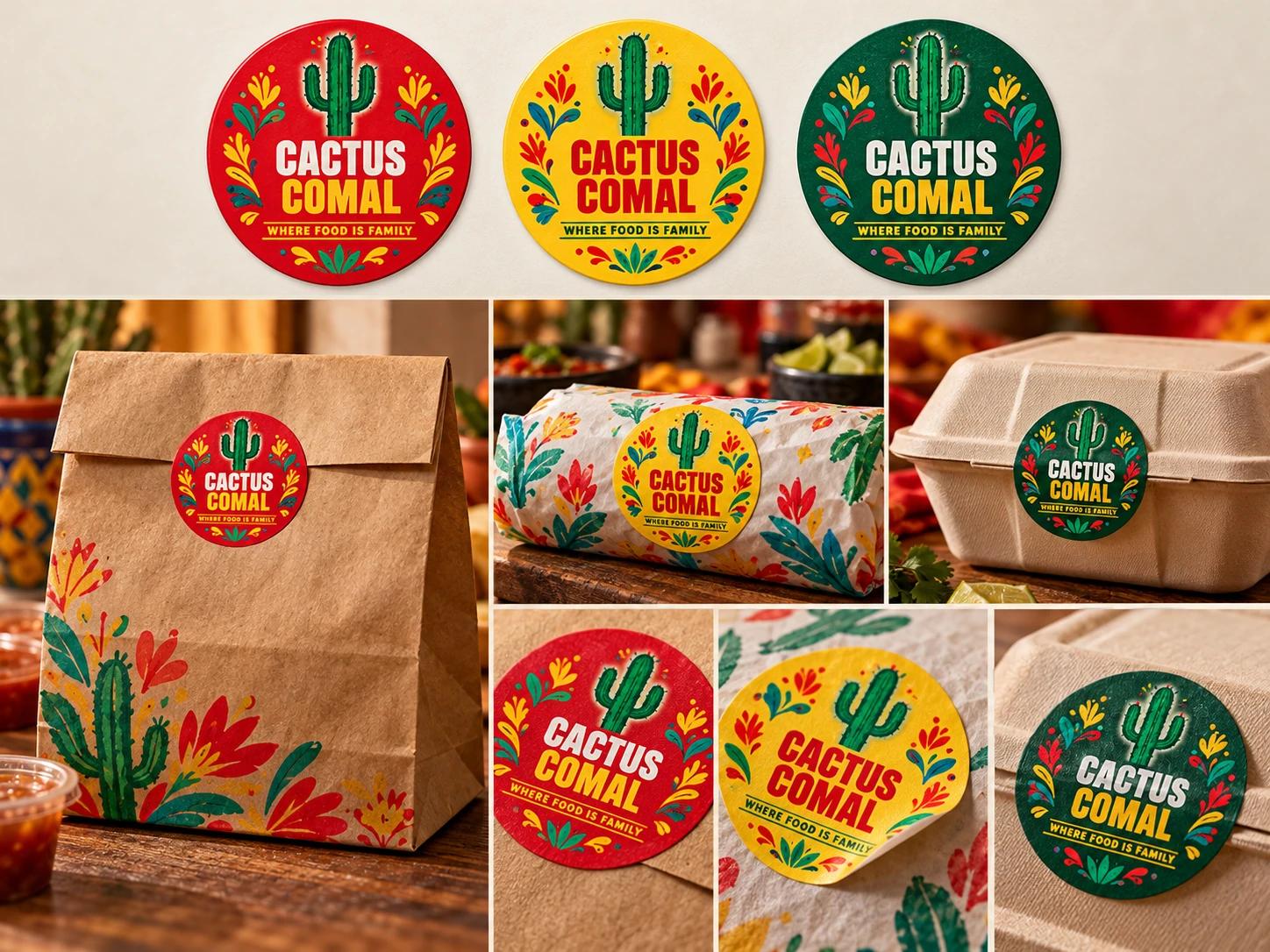
Stickers and labels bring the identity into the small details. These red, yellow and green versions can seal a bag, label a container or add the brand to plain packaging. The colours change; the business is still easy to recognise.
Refresh or rebrand?
If people already know you, keep what works and tighten the rest. That’s a refresh. Rebrand when your why has changed, or when the way you look and sound has stopped matching the way you work.
How we work
Questions first, not sketches. I ask every owner the same things. Why did you start? What do your best customers say about you? What won’t you cut corners on, even when it would be easier? See how the answers become one sentence
Then we build outward: the why first, the look last. It’s why Cactus Comal’s page talks about the table before it shows you a single taco.
By the time anything gets designed, we already know what it needs to say. That’s the difference between a brand that looks nice and one that gets you hired.
Want to go deeper? See how we approach Digital Marketing, or browse our recent work.

Let’s find your why.
Book a call. You’ll leave with a clearer brand, whether you hire us or not.